
Step into the realm where art meets utility: a world where each design decision you make weaves together to form a visual narrative as compelling and intricate as a grand tapestry in a prestigious gallery. This isn’t just about creating another document or module; this is about mastering visual hierarchy, a critical skill that will elevate every piece of visual work you create. The principles of visual hierarchy will transform your everyday materials — learning management systems (LMSs), training modules or any instructional design — into powerful tools that capture attention, enhance understanding and ensure retention.
With each decision acting like a thread in a tapestry, you might consider them insignificant alone. However, when woven together thoughtfully, they form a stunning landscape of information that not only guides but also educates with elegance and precision. You’re not merely presenting facts; you’re crafting experiences that engage, inform and inspire. You will be equipped to make every visual interaction count, turning routine educational tasks into memorable learning journeys. Prepare to enrich your toolkit and see your work transform from ordinary to extraordinary.
Visual hierarchy is a fundamental design principle that organizes content to direct and guide a learner’s gaze effectively. For learning and development (L&D) professionals, it is more than just a tool — it’s a method to highlight what’s essential, gently steering learners through information without overwhelming them.
Elements such as size, color and alignment are meticulously chosen and placed to make important information stand out vividly while supporting details blend into a coherent background. This careful arrangement ensures that learners naturally focus on key concepts first, making the educational experience both efficient and engaging. By mastering visual hierarchy, you ensure that every piece of content visually communicates priority, making the learning process intuitive and impactful.
Mastering the Elements
To effectively use visual hierarchy in learning materials, think of it as an art form. Each detail, from text placement to color choice, plays a critical role in shaping the overall learning experience.
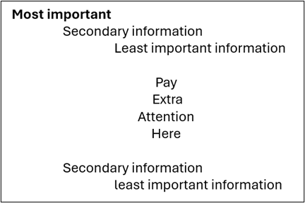
1. Size: The Beacon of Attention
Size acts as a beacon, guiding the learner’s eye to the most significant information. Much like a headline dominates the front page of a newspaper, larger elements in learning materials instantly draw focus. This principle can be used to highlight key concepts, crucial steps, or actionable items, ensuring they are noticed first and retained longest.

2. Color: The Emotional Cue
Color is not just an aesthetic choice; it’s an emotional cue that can significantly affect how information is perceived and prioritized. Bright, vivid colors naturally attract the eye and can be used to spotlight important facts or commands. In contrast, muted tones serve well for background or supplementary information, helping to maintain focus where it’s needed without overwhelming the senses.

3. Contrast: The Visual Stimulator
Contrast creates visual impact and hierarchy. Dramatically contrasted colors are particularly effective in separating information and making specific elements pop out from the canvas. This can be used to differentiate between types of information, organize sections logically, or create a focal point that commands viewer attention, much like a spotlight in a dimly lit room.

4. Alignment: The Invisible Grid
Alignment is the invisible grid that holds the design together. Proper alignment creates a clean, orderly appearance that facilitates ease of navigation through the text. Conversely, deliberately misaligned elements can stand out starkly, used sparingly to draw attention to key points or to break the monotony of a structured layout.
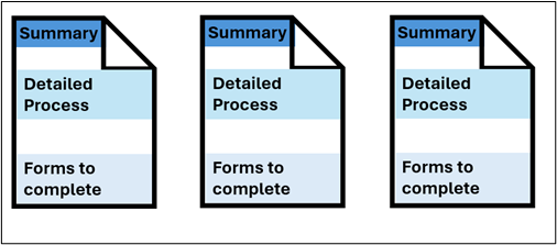
5. Repetition: The Rhythm of Design
Repetition creates a rhythm that enhances the overall cohesiveness of the document. By repeating styles, colors or shapes, designers can suggest that content is related or belongs to the same category. This rhythmic repetition helps in reinforcing memory recall and strengthens the structural flow of the information, akin to a chorus in music that ties the verses together.
6. Proximity: The Associative Power
Proximity utilizes the power of association. Elements placed close to each other are perceived as related, grouping related information naturally under the viewer’s gaze. This principle is crucial in creating relationships between different pieces of content, making the layout more logical and intuitive, much like clustering similar books together in a library.

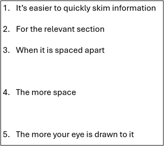
7. Whitespace: The Breather
Whitespace, or negative space, is the breather of the design. It prevents visual overcrowding and allows the eye to rest, making the information more approachable. Effective use of whitespace draws attention to important elements surrounded by space, simplifying the page and focusing the learner’s attention, much like a clearing in a forest that draws the eye.
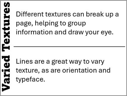
8. Texture and Style: The Character of Surfaces
Texture and style add character and depth to the design. Rich textures and distinctive styles can make elements stand out, providing a tactile quality even in digital formats. This can be particularly effective in creating an engaging sensory experience, allowing certain elements to rise from the page as if they are calling out to be touched.
Actionable Steps for Designing Document Flow
1. Define Learning Objectives
Start by clearly defining what learners need to understand or achieve after engaging with the material. This clarity will guide all subsequent design decisions, helping you select and prioritize content effectively.
2. Plan the Information Flow
Organize the content to follow natural reading patterns that accommodate cultural norms (such as left-to-right for Western audiences). Utilize common layout patterns like the F or Z shapes to naturally guide the reader’s eyes through the material, ensuring a smooth and logical progression of information.
3. Implement Visual Hierarchy
Use principles to structure and unify the design. These principles help in grouping related elements, maintaining balance and creating an overall cohesive look that makes complex information feel organized and digestible.
4. Simplify for Clarity
Avoid overloading your design with too many styles or competing visuals that could distract from the key messages. Aim for a clean and clear presentation that communicates effectively.
5. Test and Adjust
Continuously review and refine your materials based on feedback from real users. This iterative process helps you identify and correct any issues in the design flow or content clarity. Adjustments might include tweaking the size and placement of elements, enhancing contrast for better visibility or simplifying sections that appear too dense.
The Invisible Threads
When a tapestry is complete, the individual threads are no longer visible; their separate identities are lost to the beauty of the overall image. Well-designed training is the same, the individual design decisions blend into a seamless user experience. Learners may not consciously notice the visual hierarchy, but they will feel its impact through the ease with which they navigate and absorb complex information.
The true magic of visual hierarchy lies not in the elements themselves but in how they are woven together. It’s a dance of light, color and space that, when done expertly, feels as natural as seeing. As L&D professionals, our challenge — and indeed, our art — is to master this dance, choreographing an experience that educates just as effectively as it engages.
By viewing our design as a tapestry, we remember that each choice, no matter how small, contributes to the strength and beauty of the whole. It is through this meticulous process that we transform raw information into knowledge that is not only accessible but also engaging, allowing learners to absorb wisdom as effortlessly as viewing a masterpiece on a gallery wall.

